


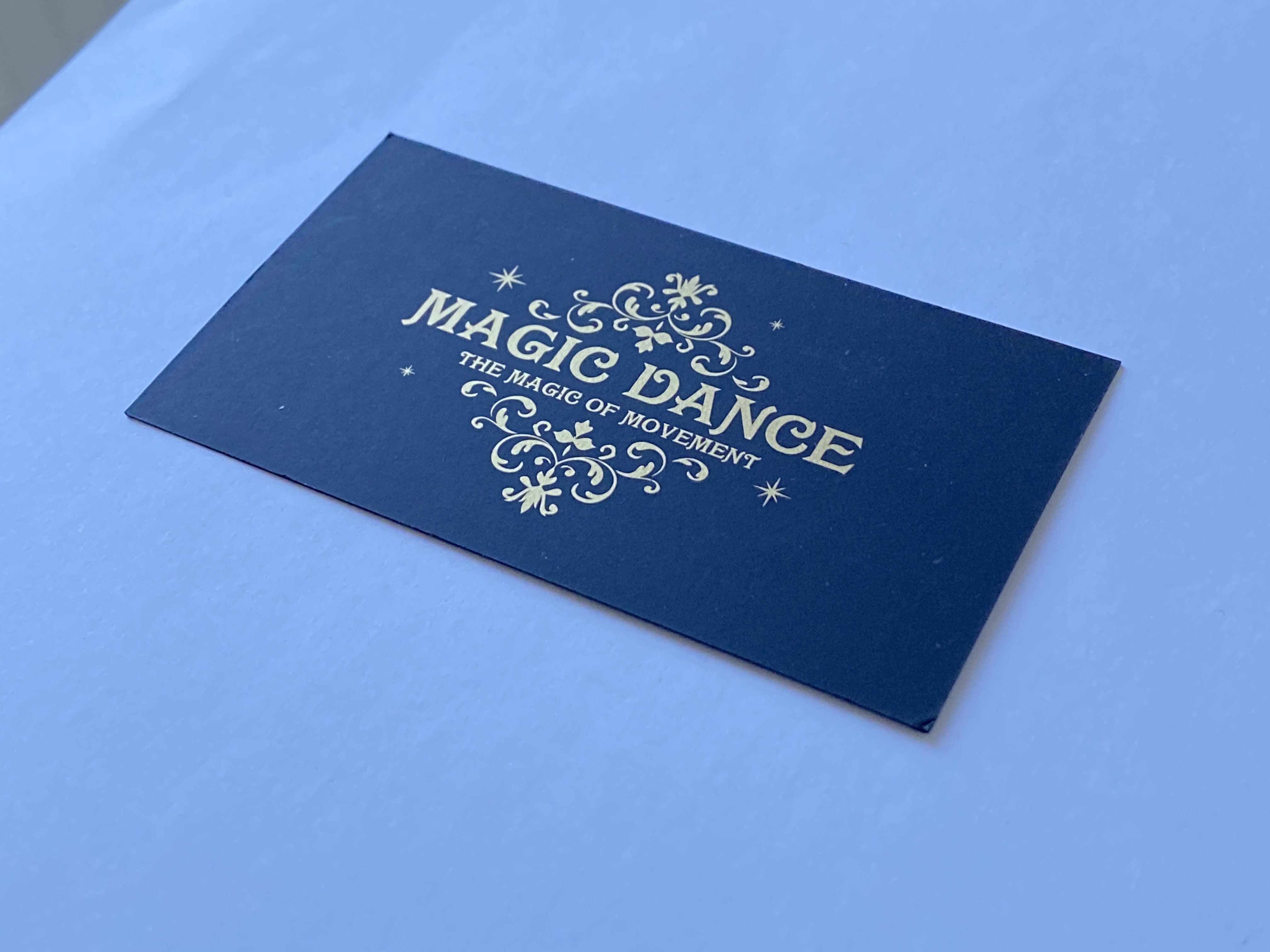
It happens at our counter all the time. Someone pulls a business card out of their wallet, tilts it under the light and says: “I want one like this, with the logo that shines.” The printing on that card is usually nothing special. What makes the impression happens after printing: varnish, foil, an unusual shape, or a velvety surface you don't want to put down.
All of that is called print finishing. You don't always need it, and plenty of jobs are fine without it. But when something ends up in someone's hand, on a shelf or in a gift bag, the finish is often what decides whether they remember it. Below we'll walk through the most popular options, where they work and where they don't, and what we need to see in your files.
Why pay for finishing at all
Honestly, it isn't always worth it. A flyer handed out at a shop entrance doesn't need foil. Neither do internal forms or price lists. But a business card, an invitation, product packaging or a presentation folder are things people hold and judge. There, even a small detail, like a glossy logo on a matt background, changes how the whole brand feels.
There's a practical side too. A laminated cover doesn't scuff, varnish keeps dark colours free of fingerprints, and a box with proper creasing doesn't crack at the folds. It's not just about looks.
Lamination: the base everything else sits on
Let's start with the one people forget. Lamination is a thin film applied over the printed sheet. It can be gloss, matt or soft touch, which feels a bit like velvet or soft rubber. Soft touch is a favourite for business cards and premium packaging because you notice the difference the second you pick it up.
Why start here? Because a lot of other finishes look their best on a laminated surface. Spot UV on matt lamination gives you that classic contrast of a matt background with a shiny logo. Foil on soft touch looks very refined as well. So when we plan a finish, the first thing we usually ask is what the base surface will be.
One practical note: dark matt lamination shows fingerprints and scratches quite easily. If the piece will be handled a lot, a restaurant menu for example, think about whether the matt look is worth it.
UV varnish: full coverage or spot
UV varnish is a liquid coating that hardens instantly under ultraviolet light. There are two main kinds, and it helps not to mix them up.
Full UV coating covers the whole sheet. It protects the print and gives an even gloss or matt finish. That's more about protection than design.
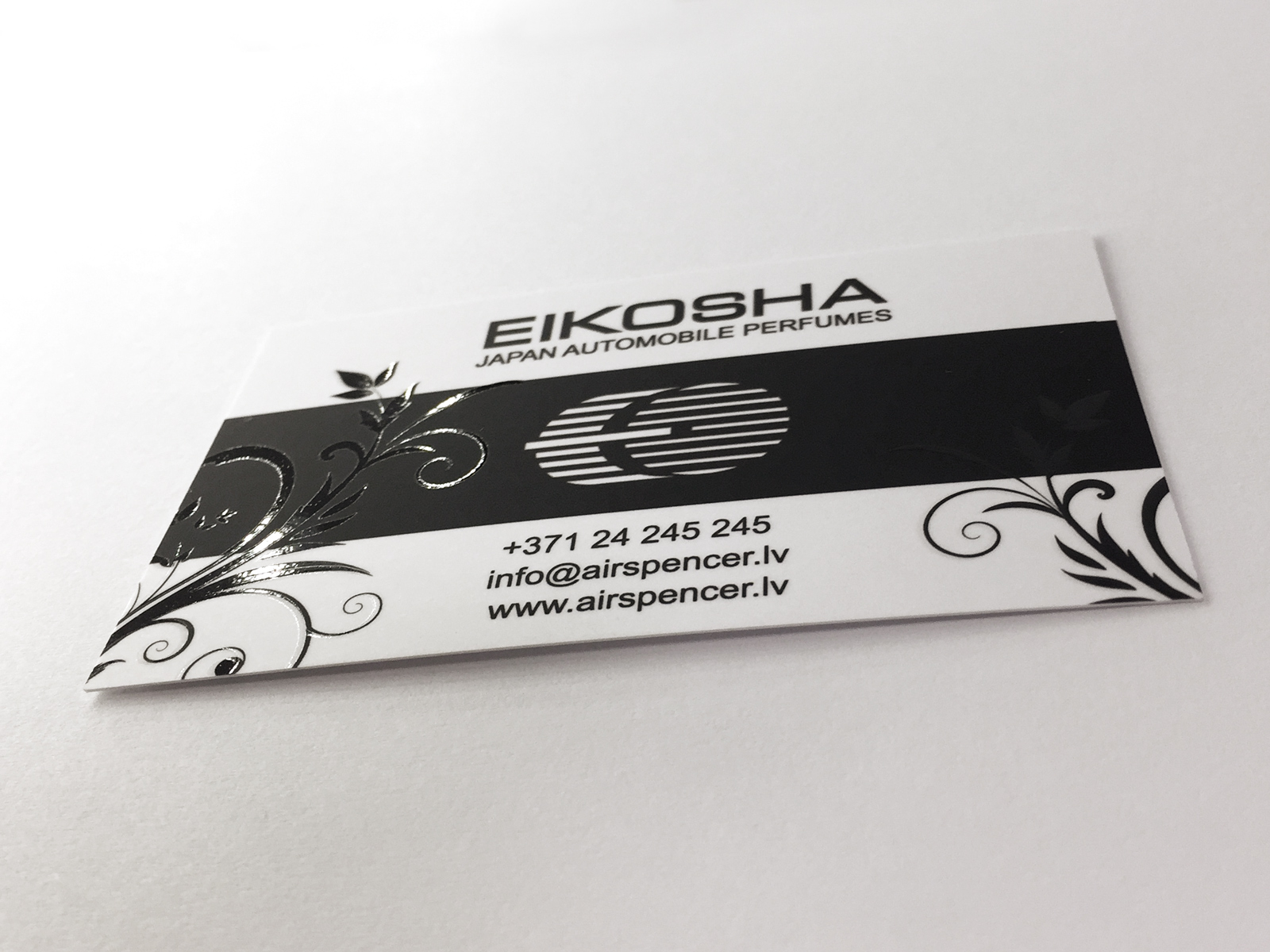
Spot UV is what most people mean when they say “UV varnish”. The varnish goes only on selected areas: a logo, a headline, part of a photo or a pattern. There's also raised or 3D varnish, which builds up above the surface so you can feel it with your finger. On business cards it looks great.
Where spot UV works best:
- on a matt or soft touch background, where the shine stands out against what's around it;
- on bold, clear elements rather than small text;
- on dark colours, where the reflection is easiest to see.
Where it lets you down is small type with thin strokes. Varnish is a liquid, and very fine details can bleed together. If you want to highlight contact details or a short tagline in a small size, pick a different technique.
Foil stamping
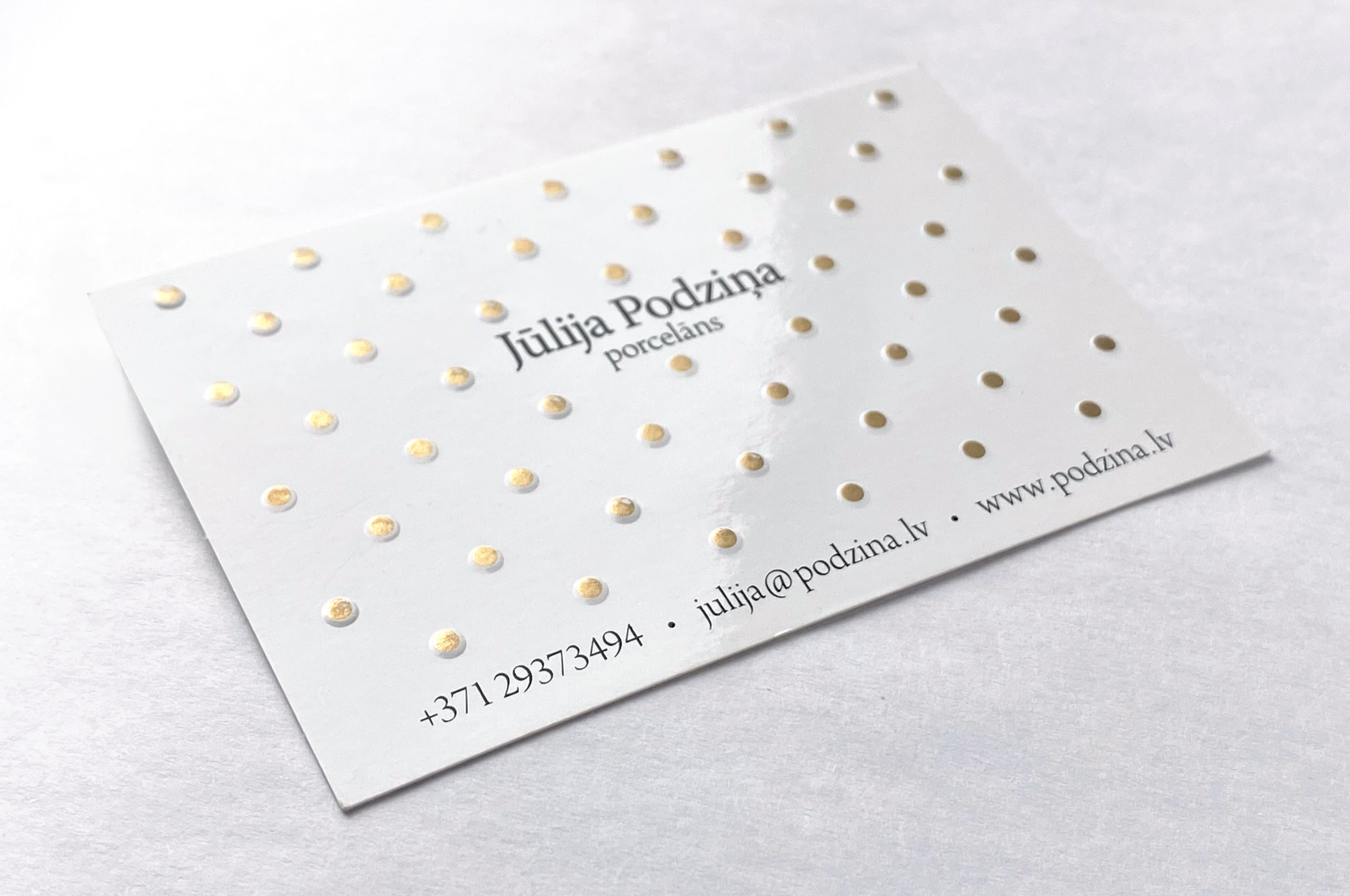
Foil stamping is the gold and silver you see on wedding invitations, wine labels and pricey business cards. It's a mechanical process: we make a metal die with your artwork, heat it and press a thin layer of foil onto the paper. Foil comes in gold, silver, copper, colours and holographic finishes.
You can't get a real metallic effect with ordinary printing ink. Gold printed in CMYK just looks yellowish brown. So if your brand guidelines include gold, foil is the only way to get it onto paper looking the way it does in real life.
Worth knowing before you order:
- The die is a separate cost. It's made for each design, so on short runs the price per piece is higher. On longer runs that cost gets spread out.
- Very thin lines and tiny text may not come out clean. Foil needs a bit of room.
- Large solid foil areas can turn out uneven. If you want most of the card in gold, talk to us first.
- The paper matters. Foil sits cleaner on a smooth surface than on a heavily textured one.
Foil is often paired with embossing or debossing, where the design is pressed up out of the paper or down into it. On thick designer stock, that combination makes some of the nicest business cards there are. You can see more options on our business card printing page.
Die cutting: when a rectangle is too boring
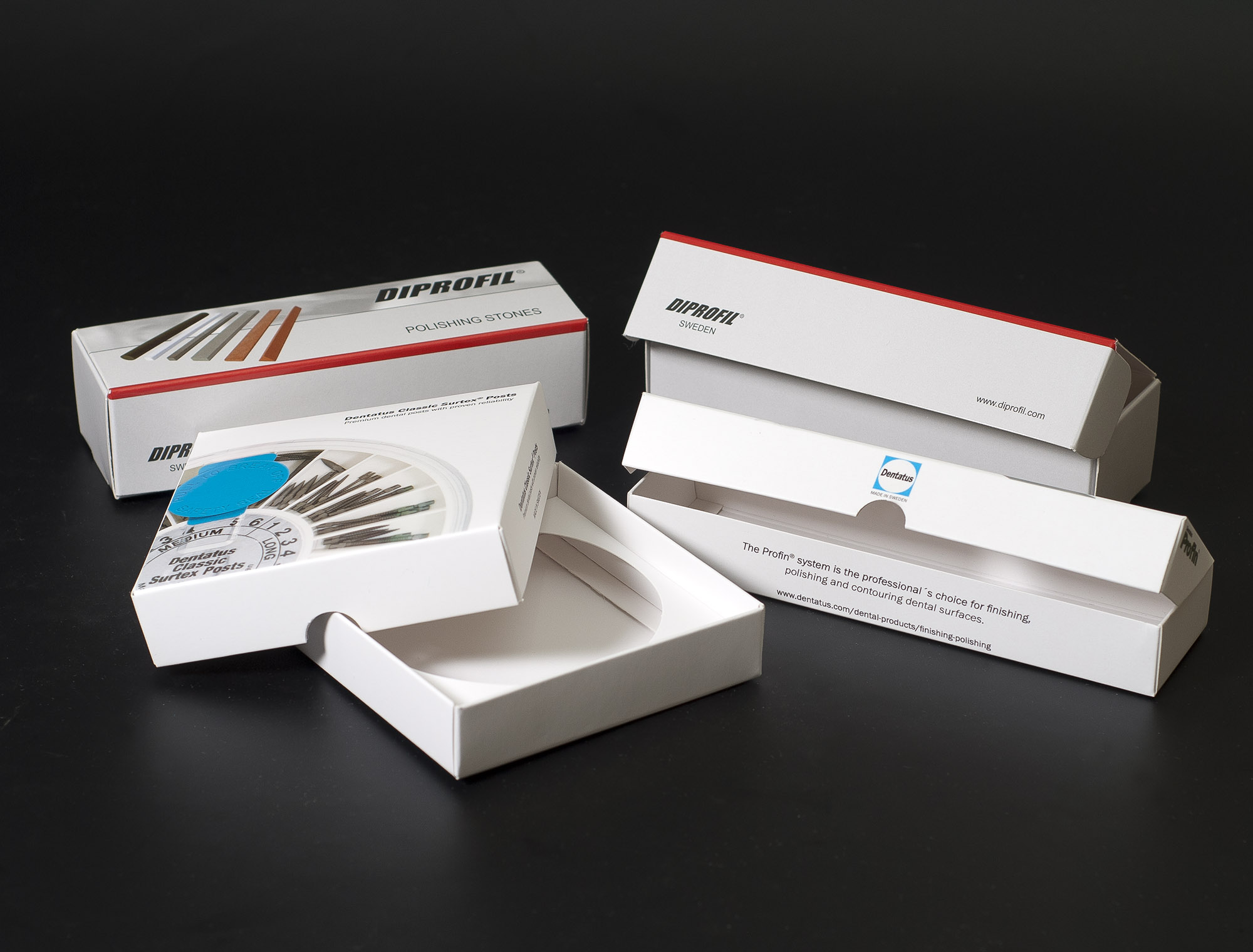
Die cutting means the piece has a shape other than a plain rectangle. That could be rounded corners, a round card, a sticker cut to the outline of a logo, or a window in a box so you can see what's inside. In packaging it's everyday stuff, because every box starts life as a flat cut-out.
There are two ways to do it. The first is a cutting die, a custom form with blades made for that particular job. It pays off on bigger runs because the cutting itself is fast. The second is digital cutting with a plotter or laser, which needs no die. That's ideal for short runs and samples, but slower in volume. Which one makes sense for you depends on the quantity and the shape, so we normally work that out in the quote.
Closely related is creasing, a pressed fold line that lets thick card bend cleanly. Without it, especially on a coloured background, the ink cracks along the fold and you get a white line. If you're making a brochure cover or a box from heavy stock, creasing isn't a luxury. You need it. If packaging is what you're working on, have a look at our packaging page.
Common file mistakes
Most finishing problems don't start on the press. They start in the file. Here's what we see most often:
- The varnish or foil area sits on the same layer as the print. We need a separate layer or file where the finish area is a solid 100% of one colour, with no gradients.
- The finish mask doesn't line up exactly with the artwork. Even a small offset leaves a shiny sliver along the edge of the logo.
- The cut line is drawn as an image rather than a vector path, or it isn't labelled. It should be on its own layer, in vector, with a clear name.
- Text and key elements are too close to the cut line. Leave a safe margin, because the cut can always shift slightly.
- A tiny or very thin element has been marked for foil.
If you're not sure how to set up the masks, send us your original design and tell us what you want to highlight. We'll tell you what to change or help you prepare it. That's always quicker than reprinting.
Questions we get asked a lot
Can finishing be used with digital printing?
Yes, many finishes work with both digital and offset printing. The choice depends more on the run size and the specific finish than on the printing method.
How much extra time does finishing add?
Every extra process is another production step, and for some finishes, like foil stamping, the die has to be made first. So expect the turnaround to be a little longer than plain printing. If you have a fixed date, tell us right away and we'll say honestly whether it's doable.
Can I combine several finishes on one piece?
You can, and that's often where the most interesting results come from. Soft touch lamination, spot UV and foil on the same business card is a perfectly normal combination. Each step adds to the price, though, so we usually suggest picking one main highlight rather than throwing everything at it.
How can I see what it'll look like before the full run?
You can't really show a finish on screen, because shine and texture are physical things. If the job matters, come and look at samples with us or order a small test before the main run.
Not sure where to start?
Our simple advice: pick the one thing you want people to notice first. If it's the logo, make it stand out with foil or spot UV. If it's how the piece feels in the hand, start with soft touch. If a product needs to catch the eye from across the shop, think about an unusual shape. One clear highlight nearly always looks better than three effects fighting each other.
And if you're still unsure, send us your design and tell us what it's for. We'll point out where finishing really earns its keep and where you can safely save.
